Most music magazines have a target audience of young people, it also depends on the artists they are going to feature. Although Magazines such a Mojo have a older target audience because they feature older artists such as the Beatles, and a lot of rock from the 70's and 80's, music that appeals more to older people such as middle aged people. If a magazine is going to have lots of posters in such as Kerrang their target market is teenagers who will put the posters in their rooms.
Where as a magazine such as NME will have a wide target audience because of the wide variety of content they have in their magazine, features that will appeal to younger and older people.
Monday, 10 December 2012
Font ideas

Music magazine research
Top magazines- There are many different music magazine genres, such as rock, pop, hip hop, even surf rock.
The popular magazines, are one such as Kerrang, NME, Q, Rock Sound Nme focuses on indie and rock music, and their target audience is around 16 and over more focusing on young adults rather than young teenagers. They also aim for anyone who is interested in they type of music they focus on , and its published weekly.
A really big music magazine is Kerrang, the focus on rock and screamo music. I think their target audience is mainly teenagers, they talk about a lot of bands with younger fans, and have many posters inside, which teenagers will use. It is also the UK's biggest selling rock magazine. It is published weekly.
The worlds most popular music magazine in Mojo. Their main focus is classic rock music. I think this magazine has a target audience 18 and above, as it focuses on older performers such as the Beatles.

Monday, 3 December 2012
Contents analysis

Contents analysis

Contents analysis

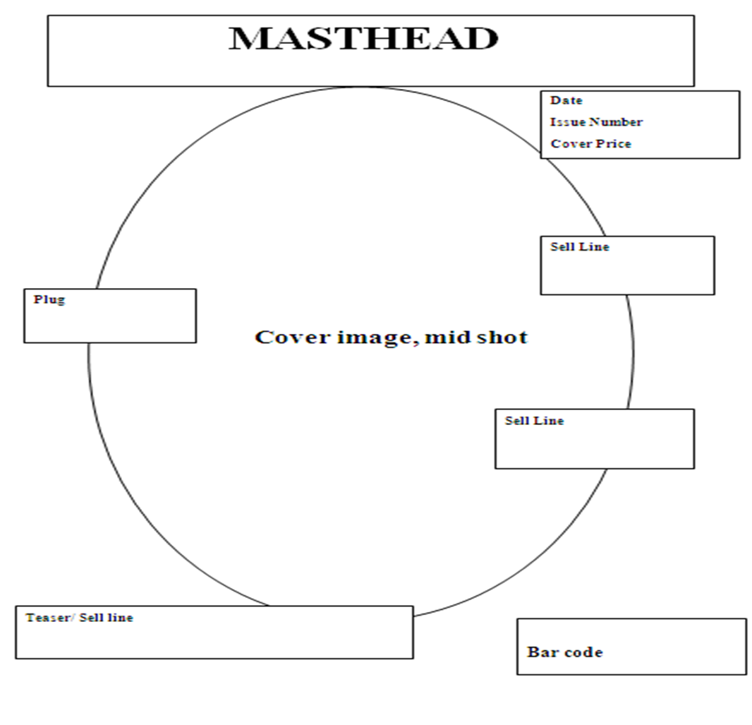
Cover analysis
This is an example of NME magazine cover, it's a special edition so the cover image is in black and white, with only the masthead and sell lines in colour. The cover image is not a studio shot, so it doesn't have one block colour as a background it has buildings. I like the way this looks espically, with the black and white colour scheme. But i dislike the red for some of the text, it suits this magazine, but i personally like other colours with black and white. Its very simple and has only one image, which i think works really well with the colour scheme. I also really like where they have placed the text, the very top, they very bottom, and across the middle of the cover image.
 I would like my college magazine to be lightly based around this cover.

Monday, 26 November 2012
Cover analysis


These are two covers of the same magazine. They are both very simplistic in their colours and design, but one has a lot more to look at compared to the other. For my college magazine i would rather base mine of the cover on the left because it has more text, which i would need for a college magazine to get people to buy it. What i like about the one of the left is the colours, and the very simple background which just main picture, which is what i like about all Vogue covers. I really like the colours of the left cover, they all go really well, and are colours i would be using on my magazine covers.
Survey results
I did a survey online to help gather ideas for my college magazine cover. I asked questions about things such as price and articles to help me see what people would be interested in.
Firstly All of the people that completed the survey were aged between 13 and 19, and 30% were male and 70% female. I found this helpful as within this age range would the target market for a college magazine. And it could be mainly females that might buy a college magazine, this well help with my design.
Most of the people who answered said they would buy a college magazine if they could, if it had something they would be interested in. This surprised me because i expected more No's in this answer.
I have different answers for the price, most people wouldn't pay over a pound and would pay between 10p and 50p. I expected people to not want to pay but if they did pay i thought the answers would be over £1.
78% think it should be published fortnightly, 11.1% said weekly and 11.1% said monthly.
80% of the people are interested in music, 60% fashion, 60% films, 30& reading and 20% are interested in sports. This is what i expected when i asked this question, that most people would be interested in music.
Most people said that they would want to see articles about things going on in the college and things such as music. A few people also said articles on new books would be something there interested in, as well as interviews and other news.
This survey did help me a little bit as it gave me a better idea if what would featured in the magazine and how much it would be priced and published.
This link is a direct link to the survey i created.
http://www.surveymonkey.com/s/J5WBXNB
Magazine Drafts


contents page examples


College magazine cover examples


Magazine examples


Shot Types


G321: Foundation portfolio in media
Using DTP and image manipulation programme , i am producing the front page and a contents of a new college magazine. The front page will feature a medium close up of a student and across the remainder of the magazine four of my own photos.
Following on from this the main task is the front page, contents and a double page spread of a new music magazine, which will be using more of my own photos.
This blog will be used to record all my planning and research, so it will be easy to keep track of what i have done, and what needs to be done.
Subscribe to:
Comments (Atom)